
This article is about one of the journeys from taking a product, in this case, the SAP Analytics Cloud, and building a useful tool that creates business value. You can substitute here for any other Self Service BI tool, e.g., Power BI.
The main difference between working as an IT professional in a large corporation that’s not in the IT business is that your main job is to start with whatever IT companies think you need and build a solution that does what you actually need.
The dashboard that shows just numbers misses the point.
The first thought that comes to mind when thinking about Self Service BI is a beautiful dashboard that shows the critical business numbers while giving you an excellent overview of everything you need to know and how those numbers perform over a given time frame.
How could this not be helpful?
Well, let’s think about what the average middle manager that will use the tool later needs.
You might ask why only middle managers would use these tools. The simple answer is that if you had to prepare a C-level dashboard, it would be too big to consume.
It’s the Controller’s job to take and prepare presentations that point out the critical numbers at a given moment and prepare presentations that highlight their specific relevance. Designing an automated Dashboard fails as the story that the data needs to tell can vary significantly in a given circumstance.
In contrast, it seems useful that a Controller uses BI tools to make sense of the data before preparing a C-level presentation. With augmented analytics, a machine might do this prioritization of abnormal data in the future. However, the future is not now. At least not in your average industrial company.
Actually, the topic is quite big and deserves a separate post. For this article’s sake, let’s agree that the middle manager is the main target for Self Service BI tools.
The main job of the middle manager is process optimization.
Process optimization is a multi-step process. Depending on your source, the number of steps and their names might vary. Generally speaking, it’s the following:
- Identify that there is a problem
- Analyze the root-cause
- Define actions and execute them
- Check if the actions were successful
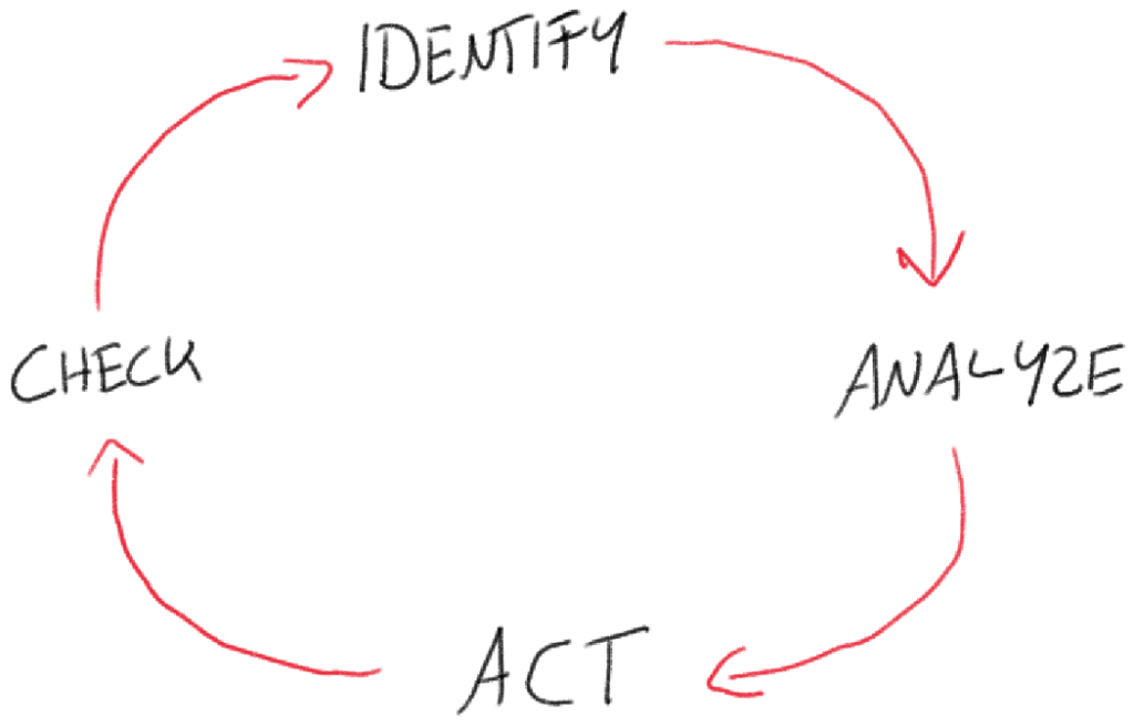
The managers’ success is measured mainly by this task. That is correct in most cases as he is usually receiving a bonus based on how well the KPIs under his responsibility perform over a given period. Our goal is to design an information system to support him with this task. The best way to do that is to help him answer the main questions related to each step based on the data we have:
- Is there a problem?
- What caused the problem?
- Which actions should we take?
- Were the actions successful?
From looking at the questions above, you can already tell that the dashboard described at the beginning of this article only helps answer the first question. Most of the value that an automated analytics solution could have is left out.
Let’s have a look at how a more sophisticated solution could answer these questions. I took the screenshots from one of the actual dashboards we implemented at my company. To make it readable at this page layout, I included only the essential parts (lego bricks) of each dashboard part to get the point across. The numbers are anonymized.
IDENTIFY / Is There a Problem?
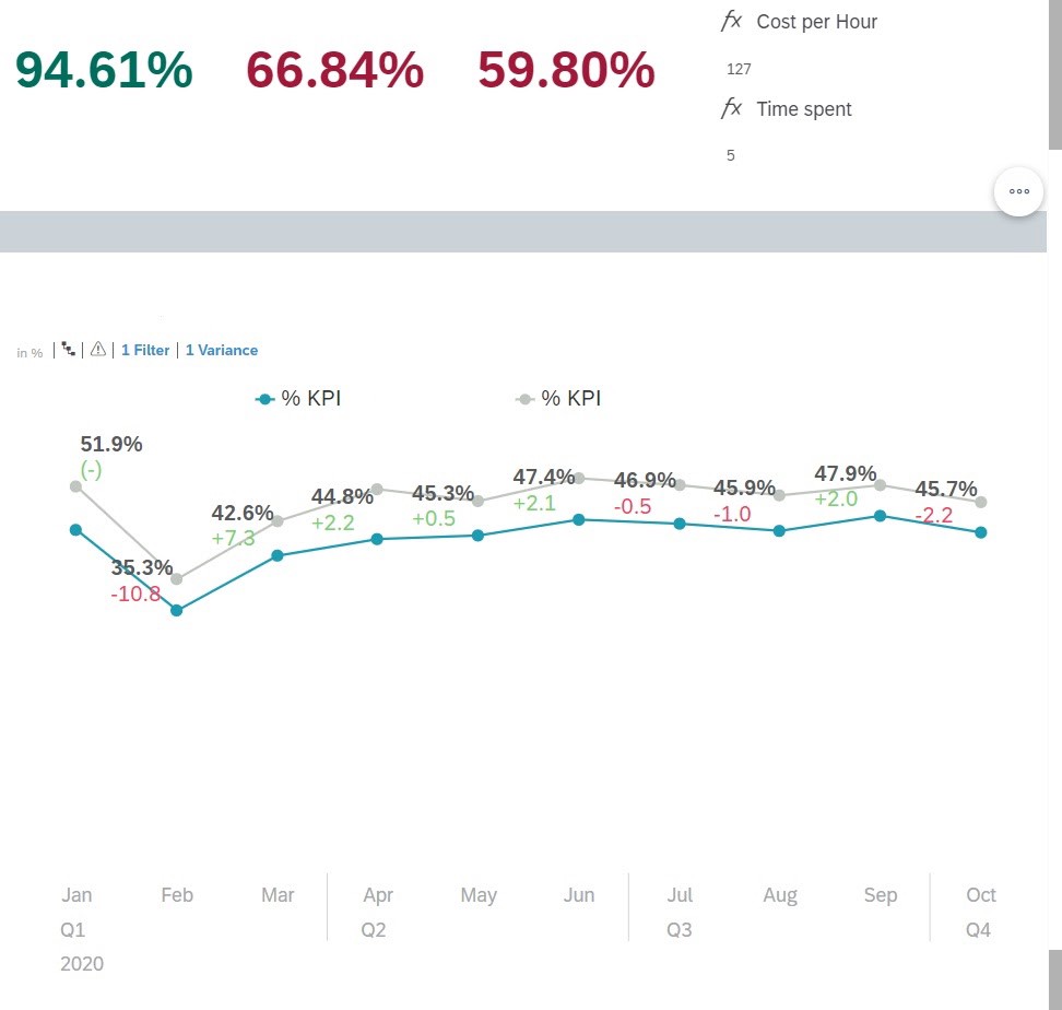
In this screenshot, you can see the classic dashboard that usually gets printed on marketing materials. The actual numbers of last period’s KPI were placed on top. Below you can see the trend over the previous months. If the KPI crosses a certain threshold, it turns green/red to indicate whether the result got better or worse than last month. For each KPI, you can jump to the root cause analysis by double-clicking.
ANALYZE / What Caused the Problem?
The main idea is that a bad result is, in most cases, not caused by the average. Most of the time, outliers drag down the overall result. Consequently, showing a top-level KPI without quickly allowing for root cause analysis leads to ineffective actions as the vast majority of dimension members are not a problem. Problems often cluster around a particular attribute of a dimension that all members have in common.
For example, Suppliers based in Hong Kong perform worse than suppliers from other countries. It’s easy to then drill down into suppliers from Hong Kong.
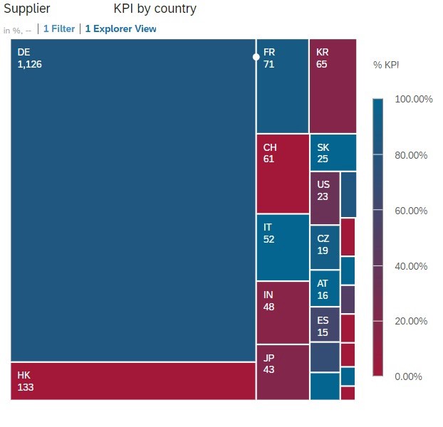
By spreading out the KPI along critical dimensions and attributes, the manager can quickly narrow down the possible causes.
ACT / Which Actions Should We Take?
As the time available to the team for making improvements is limited, it’s essential to prioritize effective actions. To find the most effective actions, we need to first think about which actions the manager can take and which dimensions will be influenced. Most of the time, it turns out to be not that many, so it’s even more important to know them. Examples might be his direct reports, specific system settings, and vendors or customers.
In the analysis section, we already discussed the importance of outliers. Outliers are exponentially more beneficial to work on as the same action is usually required to improve both an outlier and an average member, while the potential increase of the overall KPI is much greater with the outlier.
The graph above shows the top customers that had the worst impact on the KPI over the last period. Most of the time, we can calculate this by the overall KPI of the customer times the transaction/activity frequency. E.g., A frequent customer performing badly will drag down the overall KPI more than a one-time customer.
When we compare this potential for improvement for each customer, we can see that customer 352581 has much more potential than customer 272873. Assuming the same amount of work is required to improve each customer, it’s a much better choice to work on customer 352581.
This shows that the impact we can have with our actions is more determined by which customers we chose in the first place than how well we carry out the activities.
Assuming we have time to work on the top 3 customers each month, we can now simulate the overall KPI outcome. You can see the second green bar on the leading three suppliers in image 4–1. Improving these customers with 90% confidence would result in below improvement on the overall KPI.
Confidentiality and customer choice can be adjusted without additional effort, which allows the manager to simulate possible actions, formulate the best measures, and set a realistic target for the next period.
Including the managers’ expert business knowledge in this step is essential as specific customers will have more or less business in the future, or some customers might be harder to handle than others.
CHECK / Were the actions successful?
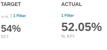
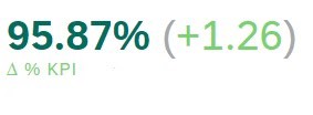
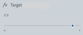
Setting a goal to achieve for each period helps the manager understand if the defined actions were successful. It’s a step often overlooked but extremely important because it shows the improvement over time and, therefore, the team’s work.
In a real-world scenario, the chart never increases steadily but looks more like the stock market’s ups and downs. As with the stock market, if the trend goes up, the actions are successful. If decreases can be explained (e.g., CoVid19), everything is fine.
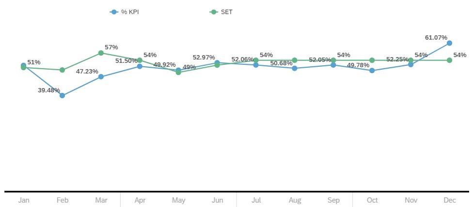
The chart shows the target SET for each month compared to the actual figures.
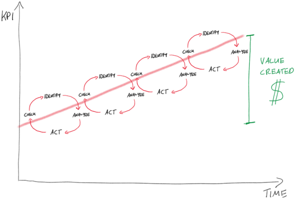
You can think of the improvement process as a circle that continually iterates, moving upwards in the best case.
Similarly, the dashboard’s value can be judged by the value difference between the introduction and the current period over time.
However, it’s essential to understand that the actions taken and not the dashboard itself are responsible for the improvement.
How to improve even more!
As there is no perfect solution, there is one feature missing I would hope SAP would implement in the future:
All actions coming from the insights must be captured and followed up outside the tool. I would love to see integrated task management or direct integration to a tool like Trello that helps create and follow up on tasks derived from insights.
If you have suggestions on improving further or have successfully implemented a similar framework, please leave a comment. Let’s have a discussion!