
The Advantage of making things dynamic
There are many ways to build reports in Power BI. Like in coding there are many ways to accomplish the same thing. And as with code, there are ways to make your reports easier to maintain and less prone to errors when implementing changes and, well, ways to do the opposite.
This article explains how to build dynamic and easy to maintain Reports in Power BI (and how to avoid the opposite)
What not to do
To understand the value of a solution, it is crucial to understand the problem first. In this chapter, I will explain what not to do and why not to do it.
Using bookmarks to Change Charts
With bookmarks, you can create snapshots of a page at a specific time. You can add bookmarks to a button that allows you to switch between them by pressing it. This technique enables you to make charts visible and others invisible, creating the illusion that the measure in a chart changed. (If you don’t know what I’m talking about already, you can check out his video.)
While this oftentimes solves what’s required, it creates a problem of its own. You now have two charts to maintain. Or 3 charts, or 4. Depending on how many charts you want to change by click. Imagine a change in the measures you want to display in these charts (or even the change of the measure display text). You need to maintain all the charts and update the bookmarks. From my experience, it’s a nightmare to maintain this.
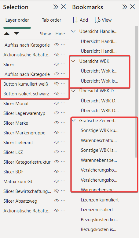
The screenshot below shows a report that extensively used the bookmark feature on every page to switch between measures in charts. Every bookmark on the right creates a new selection view on the left, where the visibility of the charts has to be maintained differently to create the desired effect.
Don’t get me wrong. Bookmarks have their place. Toggling on or off a filter pane etc. is impossible without it. However, changing chart content with them creates a report that takes a lot of work to maintain. If a customer requirement can not be fulfilled without the extensive use of bookmarks, it’s usually better to rethink the requirement. Can it not be done more simply? Can we create an additional page?
To display dynamic measures in Dashboards, you don’t need bookmarks. I’m going to show you a better way in the next chapter.
Creating additional Report pages that do the same thing
Setting up complex navigation for pages that do the same thing is another common mistake. This video explains the basic concept. However, this is where the problem comes in:
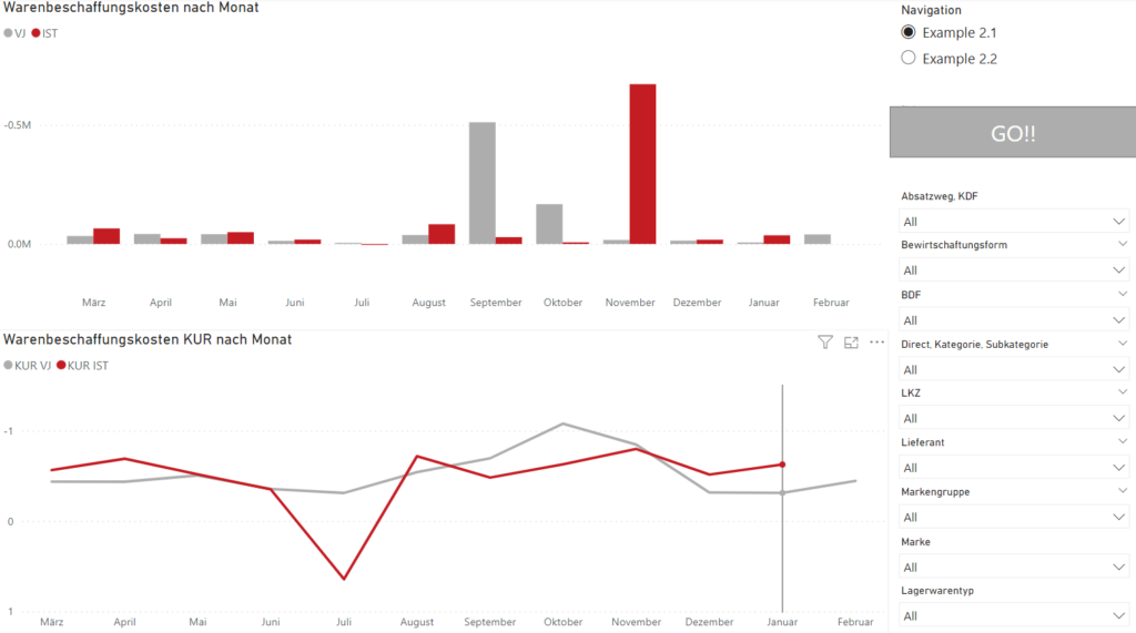
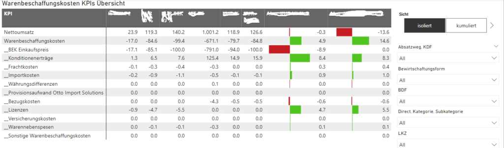
Say you have cost KPIs where all of them should be visualized the same way. A bar chart on top shows the monthly values and a line chart at the bottom shows the cumulated trend:
Now I use the technique described in the video above and create two more pages for the additional KPI and use the page navigation to switch between them.
So far, so good. Now imagine business wants to change the color of the line from red to a darker red due to corporate design. Or imagine the header should change, or we must add a new filter. You’ll need to make the same change on all pages!
For 3 KPIs, it might work. How about doing it for 50 or 100?
I faced this scenario in multiple customer projects where the number of relevant KPIs was huge. There’s no way to create a separate page for 100 KPIs.
How to create dynamic and easy to maintain Dashboards?
The question you should ask yourself for every visual and page: How can I build this page/visual so that in case of changing requirements, I need to make changes in a minimum of places?
In the following section, I will go through some dynamic solutions for problems that are usually solved in a static and hard-to-maintain way with the techniques I described above.
Use Calculation Groups and Measure Grouping
Business Requirement: A Matrix should display multiple Measures in an isolated View by month. Pressing a button should show the current year’s cumulated Sum.
Static/Hard to maintain Solution: Create two Matrixes—one with the isolated Measures, One with the cumulated Measures. Use Bookmarks to toggle their visibility on/off.
Dynamic/Easy to maintain Solution: Use Calculation Groups and Grouping
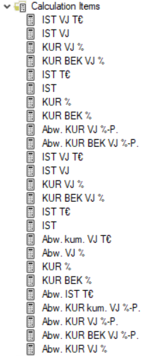
Create calculation groups for each Measure (Isolated & Cumulated):
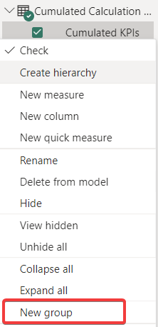
Right-click on the newly created Calculation Group Column and create a “new group”:
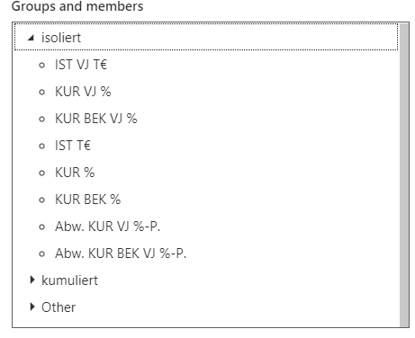
Then group the Measures into two categories (Isolated / Cumulated):
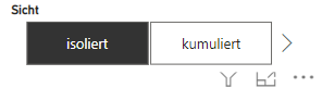
Now create a slicer for the newly created group/column:
Create the Matrix and use the Calculation Group in the columns. Now the button will change the Measures by clicking:
The Advantage:
There’s a change in KPI –> You only need to add it to one Calculation Group.
There’s a change in the Matrix Format –> You only need to edit one Matrix + no need to update any bookmark.
Use Switch Measures and Dynamic Headers
Business Requirement: Visualize many Measures with the same Charts.
Static/Hard to maintain Solution: There’s no way to change the Measure in a Chart with a Button. –> Create a page for each Measure
Dynamic/Easy to maintain Solution: Use Switch Measures and Dynamic Headers.
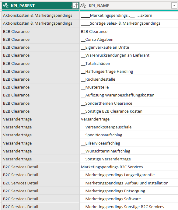
Create a central table that contains all KPIs:
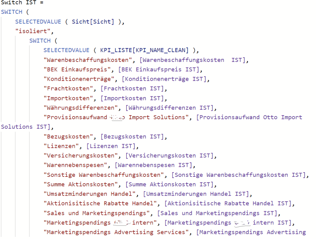
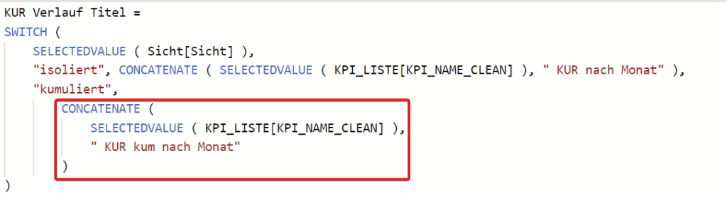
Create a SWITCH Measure that depending on the selection, displays the corresponding Measure value for the KPI name:
Pro Tip: You can combine this with the first solution to not only dynamically SWITCH the Measures but also Show isolated or cumulated Values:
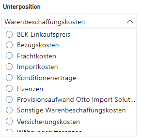
Now all you need to do is create a Slicer for the KPI Table Column:
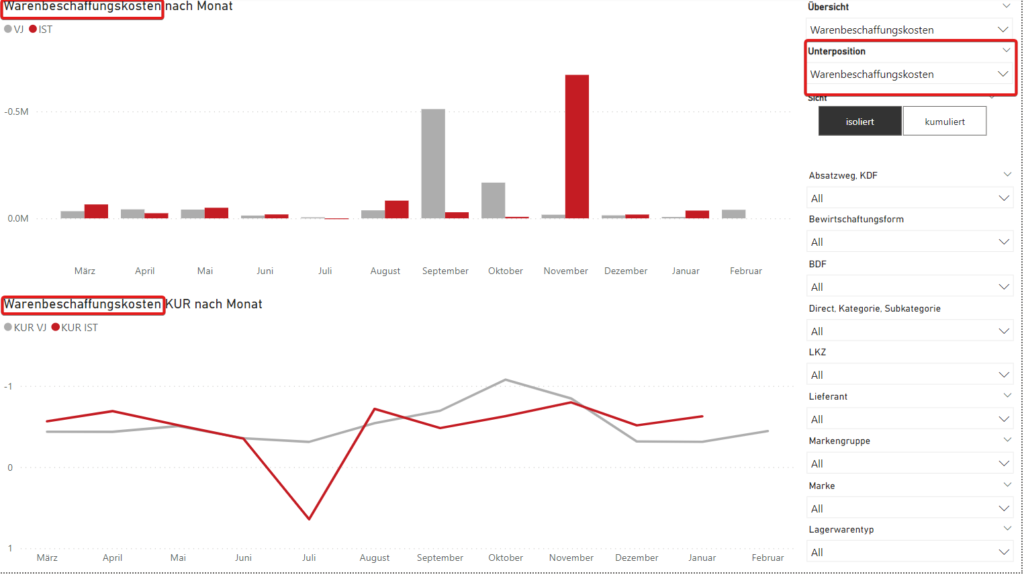
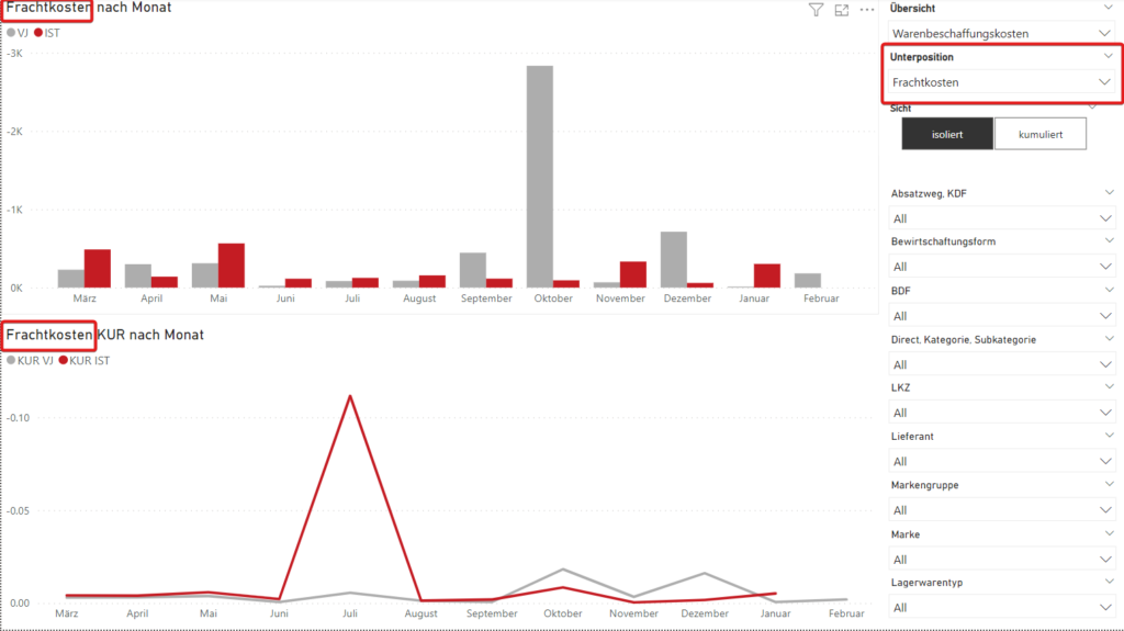
To make the users better understand what you’re displaying, create a dynamic Title for each Chart:
Pro Tip: This could again be combined with the first technique:
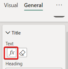
Add the new Measures as the chart title in the formatting option:
Now you can dynamically SWITCH through all the Measures in your List:
The Advantage:
There’s a change in KPI –> You only need to add the new KPI name to the Switch Measure and the KPI table. You don’t need to create a new KPI page and change all the Charts and titles.
There’s a change in the Matrix Format –> You just edit one page. You don’t need to edit All the possibly 50 pages.
If Microsoft reads this: It would be nice to have an option in the SWITCH Measure to refer to a table as a Measure table. The SWITCH Measure would then automatically contain all the Rows in the KPI table column and search for corresponding Measures with the same value. This way, the only place to add the Measure would be the KPI table 🙂
Conclusion
We’ve seen in the two examples that features in Power BI can be overloaded and create inefficient solutions. To avoid this, think like a Software developer. How can I make this chart/page dynamic and, therefore, reusable? This thinking will make your Dashboards less error-prone and let you maintain them faster. Your Customers and colleagues will thank you. Trust me.